|

DOUBLE ‘CLICK'...!
Now you can CLICK more often! The web and digital media is such a hot topic and we’ve received such a great response to the ideas and news inside
CLICK, that we’re pleased to now issue TWO editions a month starting
today!
CLICK is the latest in a series of popular e-newsletters from Vision Monday, designed specifically to provide practice insights and ideas about
the latest Web site features, tools and Web-based applications. Every edition spotlights how ECPs and optical retailers are using new approaches
to build their presence online and grow connections with their patients.
Catch up on CLICK! Learn from dozens of stories, tips and interesting ideas in the easy-to-access archives of CLICK at
www.visionmonday.com. Tried something new on your Web site
or have you launched a special social media campaign?
Tell us about it and we'll consider it for an upcoming feature in CLICK.
—The Editors

A “Digital Transformation” for Doctors Vision Center's
New Web Presence
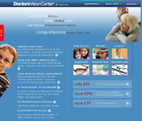
GREENVILLE, N.C.—The development of its new Web site, which 50-unit
Doctors Vision Center launched late last month, was a year-and-a-half process of
examination, discussion and research, according to executives. And the process is recognized by management as one that will continue, even as the
site starts to build new awareness and patient connections via interactivity and social media.
 Sherrie
Rogerson, vice president of retail sales/franchise services, and Suzanne Berardi Gould, Doctors Vision Center’s creative director,
described the process, working with local Raleigh-based True Parallel, a digital media consultancy. “Over a year ago, we started recognizing
how much electronic and digital media was changing and we took a deeper look at all areas, from our web page to both our doctor and retail messages
and how we wanted to update our involvement on the web,” Rogerson told CLICK. “Our goal was to make our sight more family friendly—targeting
the decisionmakers about eyecare—and we wanted more interaction on the site, among our own internal teams and with our patients.” Sherrie
Rogerson, vice president of retail sales/franchise services, and Suzanne Berardi Gould, Doctors Vision Center’s creative director,
described the process, working with local Raleigh-based True Parallel, a digital media consultancy. “Over a year ago, we started recognizing
how much electronic and digital media was changing and we took a deeper look at all areas, from our web page to both our doctor and retail messages
and how we wanted to update our involvement on the web,” Rogerson told CLICK. “Our goal was to make our sight more family friendly—targeting
the decisionmakers about eyecare—and we wanted more interaction on the site, among our own internal teams and with our patients.”
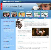 Added
Berardi Gould, “We went through everything, our creative boards, colors, the structure, soup to nuts, to develop something that could
truly reflect everything we were about, making sure our doctor message was upfront but recognizing that the dispensary was important. We didn't
change our fundamental message but we created a more modern approach.” Added
Berardi Gould, “We went through everything, our creative boards, colors, the structure, soup to nuts, to develop something that could
truly reflect everything we were about, making sure our doctor message was upfront but recognizing that the dispensary was important. We didn't
change our fundamental message but we created a more modern approach.”
Added True Parallel's Mark Rosenberg, “The discussions were strategic, asking what we want users to be able to do when they come to the
site. It's really not just about advertising or a 'web site' anymore, but the idea of a 'digital transformation.' We took to heart the idea of
'family,' 'mom', 'medical care' and then the retail component, so we broke down the architecture and navigation of the site and, importantly, set a
really good foundation for where the site can go in the future.“
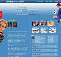 Doctors
Vision Center's new web presence spans content-rich areas about its doctors, its eyecare and contact lens centers (the group is readying online CL
ordering soon), as well as news updates and general, authoritative eye care information. Most of the site’s sections enable interactivity/exchange
with users, with 'comment' capabilities and other social media “sharing” functions for Facebook, Twitter and other hubs. An office locator drives
traffic to the individual local doctor sites. Appointment scheduling, questions/answers and display areas span other parts of the site. Doctors
Vision Center's new web presence spans content-rich areas about its doctors, its eyecare and contact lens centers (the group is readying online CL
ordering soon), as well as news updates and general, authoritative eye care information. Most of the site’s sections enable interactivity/exchange
with users, with 'comment' capabilities and other social media “sharing” functions for Facebook, Twitter and other hubs. An office locator drives
traffic to the individual local doctor sites. Appointment scheduling, questions/answers and display areas span other parts of the site.
Said Berardi Gould, “Our former site wasn't built in a CMS format, it took forever to get updates made and we had little flexibility in what
was there. But our new approach features a CMS format that is easy to use and, in addition to our main 'home' site, we set up 50 'micro' or local
sites for each of our offices so that they can customize their messages and news updates to patients, but take advantage of all the features of the
main site behind those. There's still about 25 percent more to come—as we explore e-commerce and social media—the basics are now in
place.”

2010 Social Shopping Study Reveals Clues to Consumers' Habits and Use of Customer Reviews
 CHICAGO & SAN FRANCISCO—A
new 2010 Social Shopping Study has just been released by
e-tailing group and
PowerReviews, a leading provider of customer reviews and social commerce solutions to over 850 retailers and brands such as Staples,
Drugstore.com, Gardener’s Supply, and Callaway. CHICAGO & SAN FRANCISCO—A
new 2010 Social Shopping Study has just been released by
e-tailing group and
PowerReviews, a leading provider of customer reviews and social commerce solutions to over 850 retailers and brands such as Staples,
Drugstore.com, Gardener’s Supply, and Callaway.
Over 1,000 consumers who shop at least 4 times per year and spend $250 or more annually shopping online were asked about their motivations and
preferences regarding online product research and customer reviews. The survey reveals how online
shopping has changed in the past few years, bringing online product research into the mainstream.
Fifty percent of respondents reported that they conduct research online for at least half of the purchases made (compared to 54 percent in 2007).
Twenty-nine percent conduct just a few hours of research prior to making a purchase decision while 60 percent conduct research for a week or more.
Very few consumers (11 percent) fall in between, and conduct research for just a day.
 Customer
reviews were ranked as the #1 social media tool having a positive to significant impact on buying behavior and judged as the most
important capability for retailers to have on their website, beating out customer service information and buying guides/expert opinions.
Some findings: Customer
reviews were ranked as the #1 social media tool having a positive to significant impact on buying behavior and judged as the most
important capability for retailers to have on their website, beating out customer service information and buying guides/expert opinions.
Some findings:
- Shoppers today are spending more time reading reviews before making purchasing decisions. 64 percent take ten minutes or more
(as compared to 50 percent in 2007) and 33 percent take one half hour or more (as compared to 18 percent in 2007).
- The top factors that degrade trust in product reviews are not enough reviews (50 percent of respondents say this degrades trust),
doubt that they are written by real customers (39 percent) and no or limited availability of negative reviews (38 percent).
“The findings of the 2010 Social Shopping Survey validate what we are hearing from retailers and brands—that customer reviews have become
a critical piece of the marketing puzzle,” said Pehr Luedtke, CEO of PowerReviews. “The next step for retailers is to now find new ways to
maximize the impact and reach of these reviews—such as optimizing them for search engines through products like our In-Line SEO solution.”
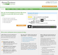
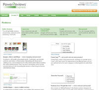
In addition to its Enterprise solution, PowerReviews offers an on-demand solution for small- and medium-sized businesses called
PowerReviews Express.
|

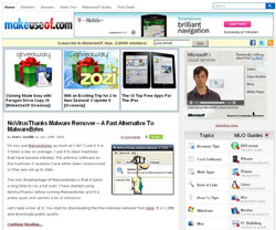
This resource-rich site works for your Web site IT guru as well as your creative team, offering a host of ways to increase productivity
and just learn about the Web. Registration on the site is free for daily updates and MakeUseOf features news, blogs and other
“beginners” guides to everything from how to best use photos, locate free APPs or add plugins to your Web site or Facebook
page. Downloadable MakeUseOf Guides are available, as is a cute “Geeky Fun” section, with cartoons, web-facts and clever bits,
along with an questions + answers section, a full Directory and a range of tools. MakeUseOf, which has over 200,000 active subscribers,
tells you about hot websites that you have never heard of, free alternatives to popular software programs, and all kinds of “how to”
tips for Windows, Mac and Linux computer users.

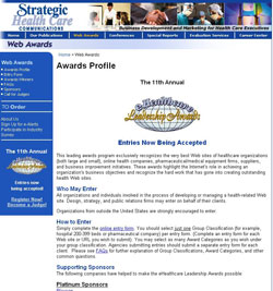
Strategic Health Care Communications conducts the e-Healthcare Leadership Awards program for health care related sites and recognizes the very
best Web sites of healthcare organizations (both large and small), online health companies, pharmaceutical/medical equipment firms, suppliers,
and business improvement initiatives. Design, strategy, and public relations firms may enter on behalf of their clients. Awards range from Best
Web site Design to Best Interactive Marketing Campaign. Winners will be recognized during the Fourteenth
Annual Healthcare Internet Conference
to be held November 15-17, 2010, in Las Vegas.


OneSight.org
The non-profit's Web site has been totally revamped to drive social interaction and involvement. The “Experience” part of
the site includes “Blurry to Clear,” to put users in the place of a OneSight recipient and experience their dramatic vision
transformation, as well of Clinic Blogs which reflect the emotional experiences of Global and Regional Clinic Team Members. The “Share”
section enables downloading of OneSight photos to be sent directly from the site as e-greeting cards with personalized messages and an easy
integration to share site content to anyone via e-mail, Facebook, Twitter, Blogger and text messages.

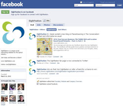
Facebook.com/SightNation
SightNation.com, the first industry-wide social networking site for both ECPs and optical professionals, is now on
Facebook and
Twitter, as well as enabling citizens to login to the site
using the Facebook Connect application. Facebook Connect allows users to "connect" their Facebook identity, friends and privacy settings
to SightNation so when a citizen posts a blog, comment or forum topic, it shares the content across both networks.
Launched on March 17, SightNation.com, has over 1,500 confirmed member
profiles, or citizens. SightNation is a joint venture of all the JMI Optical Group resources, including Review of Optometry, Review of
Ophthalmology, 20/20 Magazine, Vision Monday and LabTalk.
|